Sokotele, an emerging e-commerce and delivery platform, was entering a highly competitive market dominated by established players. The brand needed a logo that would not only stand out but also communicate trust, speed, and modern convenience—key traits for any digital-first logistics brand.
The existing visuals were generic and failed to capture the innovation and energy behind Sokotele’s mission to simplify access to goods across urban and peri-urban centers.
The Goal
To design a bold, memorable, and versatile logo that reflects Sokotele’s values:
Speed and reliability in delivery
Digital convenience
Accessibility for everyday users
A future-facing, tech-driven outlook
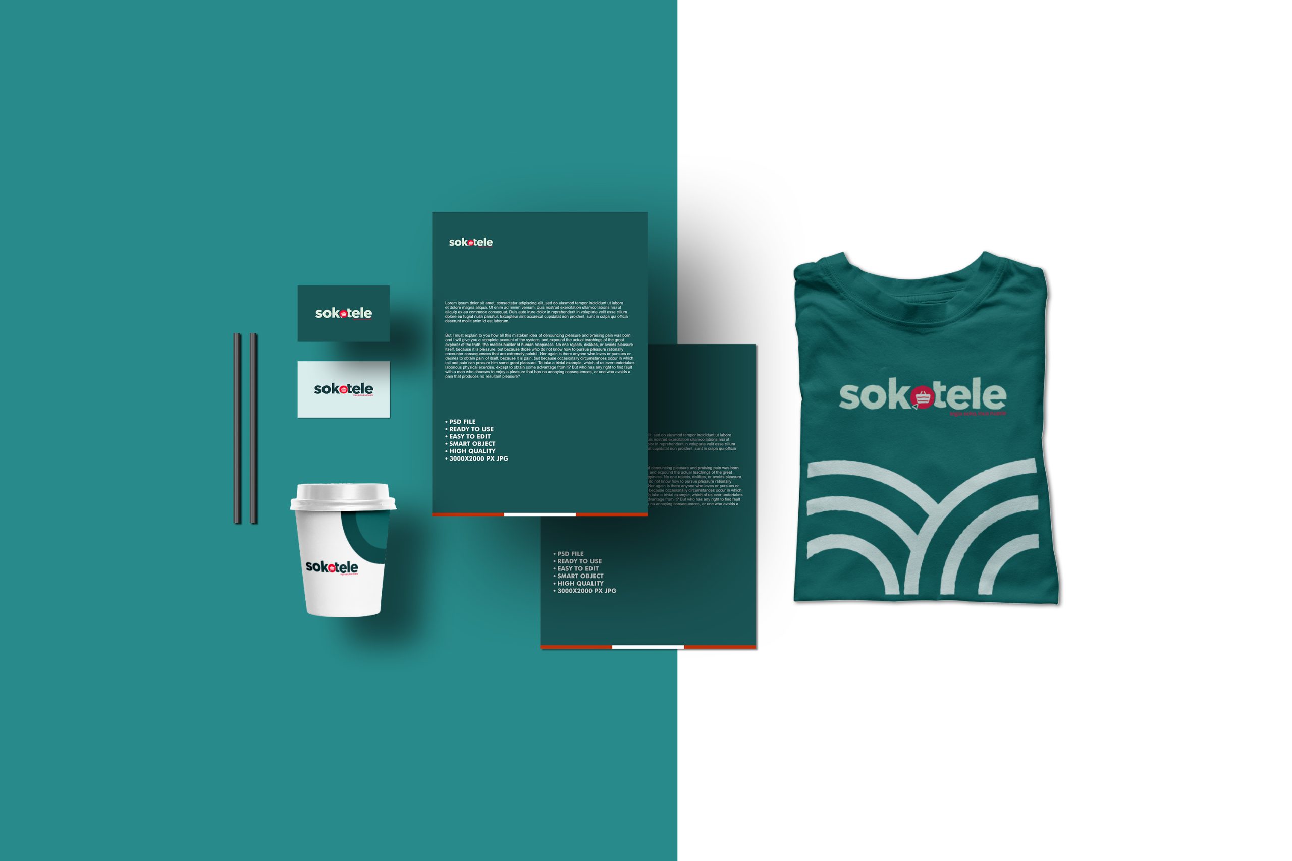
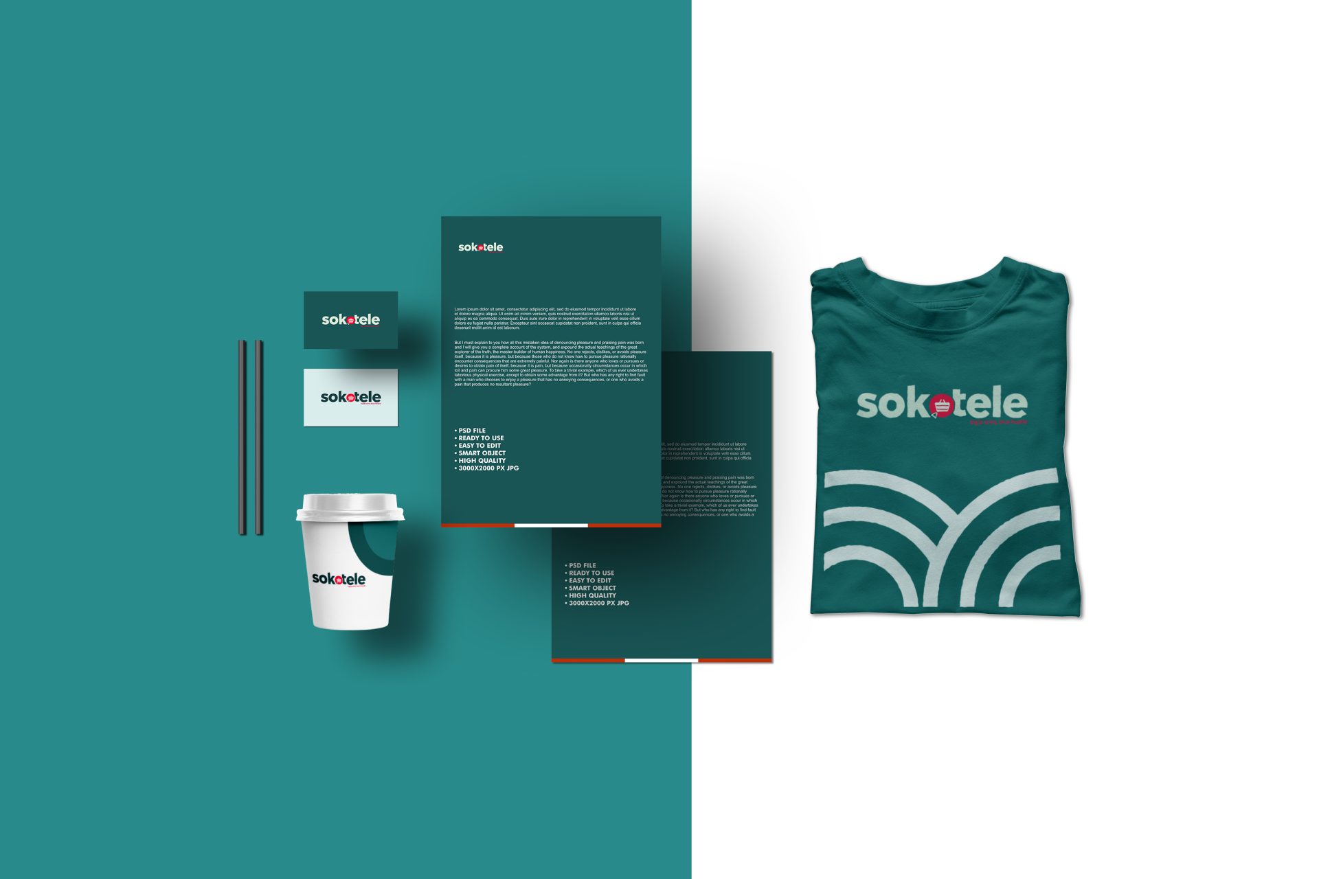
The logo needed to be easily adaptable across digital platforms, delivery packaging, uniforms, and app interfaces.
How we did it
The Process & Impact
01
Research
02
Ideation
03
Design
04
Implementation
05
Results
0x
Engagement
More Downloads
0%
00%
Brand Recall
00%
Faster Recognition
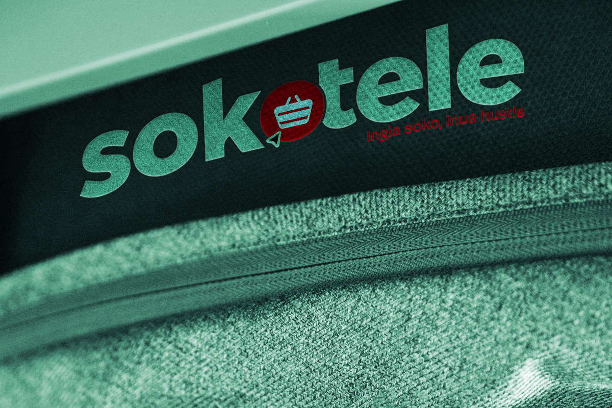
We began with an in-depth brand discovery session, identifying Sokotele’s core audience, brand attributes, and vision. Our design process combined the symbolic with the functional:
Typography: A custom, clean sans-serif font to communicate modernity and simplicity.
Symbol: A dynamic icon that subtly integrates a forward arrow and shopping basket—symbolising convenience and movement.
Color Palette: A vibrant, energetic primary color paired with a neutral to ensure visibility and contrast across platforms.
Scalability: Designed with app-friendliness and multi-device usage in mind.
We also provided a mini brand guide to ensure consistency across brand touchpoints.
The new Sokotele logo became the cornerstone of a revitalized brand identity. It has been successfully rolled out across the company’s platforms, mobile app, rider uniforms, packaging, and digital marketing collateral. Feedback from users and stakeholders highlighted how the new identity elevated perceptions of professionalism and trust.
Since the rebrand, Sokotele has seen improved brand recall and better user engagement across digital campaigns.
"I saw the artworks and am glad. They came out well."